Power BI is a business analytics tool that packs a punch, revolutionizing the way companies analyze their data. It is a cloud-based business intelligence platform that provides a suite of tools for data visualization, reporting, and analysis. Power BI has quickly become one of the most popular data visualization tools on the market, with a rapidly-growing user base and a strong community of developers and enthusiasts.
The tool has a wide range of applications, from visualizing sales data to tracking website traffic, making it a versatile tool for any business. It allows users to connect to a variety of data sources, including spreadsheets, databases, and cloud services, and then create stunning visualizations that can be shared with others.
Ready to learn more? Strap in and get ready to take your Power BI game to the next level.
Power BI Dashboard Best Practices
Despite its popularity and versatility, Power BI can be difficult to use for those unfamiliar with the platform. Discover these tried-and-true techniques that will help you create stunning visualizations, streamline your data workflows, and ultimately make better decisions.
1. Reduce the Visuals
The key to a successful Power BI dashboard is simplicity. Too many visuals can be overwhelming, so keeping your dashboard focused on the most important elements is crucial. If you need more detail, create separate reports or pages that can be accessed with a single click from the main page.
Some helpful tips to note:
- Every report page should have a minimum of eight widget visuals and no more than one grid.
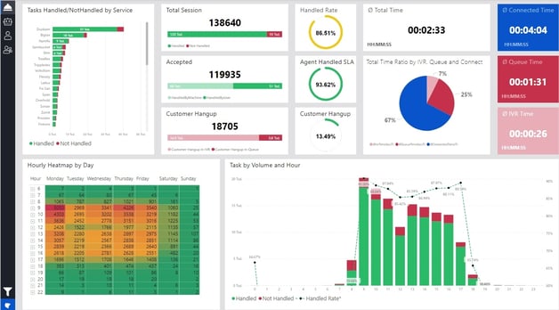
- Use only necessary visuals that would provide value to your audience.
- Group related visuals together and limit the number of visualizations per page so users can focus on the most important ones.
- Avoid clutter by removing unnecessary elements or simplifying existing ones (e.g., replacing a pie chart with a bar graph).
- Use consistent formatting across all visuals, including font size, color schemes, and data labels where applicable (this will help make it easier for users to compare different charts).
There’s no denying the power of data visualization – but if you tend to over-visualize, you can end up with a dashboard that is too hard to interpret and digest. It defeats the purpose of data visualization if it just looks like a wall of colorful graphics that don't show any meaningful information.
2. Refine Your Data Model
Before you start creating visuals and dashboards, it's essential to make sure that your data model is in good shape. This means ensuring that the datasets are clean and organized and that relationships between tables are correctly set up.
Here are some tips for refining your data model:
- Remove any unnecessary columns from the dataset (e.g., duplicate columns or those with too many null values).
- Ensure all tables have a unique primary key column (this will help prevent duplication errors when merging datasets).
- Define relationships between tables in the data model and use those to create measurements or calculated columns.
- Use DAX (Data Analysis Expressions) for more complex calculations, such as time series analysis or forecasting models.
- Create hierarchies when appropriate (e.g., geographic regions, product categories, etc.). This will make it easier to drill down into the data and find insights quickly.
Poorly structured data can lead to inaccurate results or slow performance when querying large datasets – so any time you spend refining your models is well worth the effort.
3. Take Advantage of Data Warehouses
Using a modern data integration approach like ELT (Extract, Load, Transform) combined with a data warehouse can make your data ready for analysis.
A data warehouse, such as Panoply, acts as a single source of truth where data from all sources is stored in a structured and organized manner. This enables users to access and analyze data quickly and easily, without the need to perform complex data transformation or cleaning tasks.
Using ELT and a data warehouse can help structure and clean data to make it more ingestible for Power BI in several ways:
- Data is cleansed and transformed in the data warehouse: Data warehouses have built-in capabilities to cleanse and transform data, which means that data can be pre-processed before it is loaded into Power BI. This reduces the time and effort required to transform and clean data in Power BI, making it more ingestible for analysis.
- Structured data facilitates easy analysis: A data warehouse stores data in a structured and organized manner, making it easier to query and analyze. This means that users can quickly access the data they need without spending time trying to find and organize it.
- ELT allows for flexible data integration: ELT enables users to integrate data from multiple sources and load it into a data warehouse without worrying about data transformation. This means that data can be integrated into Power BI in a flexible and scalable manner, making it easier to analyze and gain insights.
4. Optimize Security
Data security is an important part of any business intelligence system, and Power BI is no exception. It's essential to ensure that only the right people can access sensitive information. The good news is that Power BI makes it easy to set up and manage security settings on a granular level.
Using row-level security (RLS) or user roles for data filtering (e.g., by department or geographic region) can help ensure that users only see the data they need to do their job. You can also create custom roles with specific permissions (e.g., read-only or edit) so that users can access just the right information.
Ensure that your Power BI reports are only accessible to authorized users. This can be done by configuring the data sources to only allow access to specific users or groups.
Use the “Export data” setting with caution. This feature allows users to download data from visualizations, so consider disabling this feature if sensitive data is present.
Consider enabling multi-factor authentication (MFA) for Power BI users, particularly if they have access to sensitive data.
5. Use Filters Effectively
Filters are a powerful feature of Power BI that allows users to view data from different perspectives and uncover meaningful insights.
To use filters effectively, applying them sparsely and strategically is important. When applying filters, consider limiting the amount used on one page or report so as not to overwhelm the user with too much information.
Additionally, create clear labels for each filter to ensure they are easy to understand and use. Drop-down menus or slicers can be used as an effective way of displaying these criteria for the user’s convenience.
For example, when drilling down into data, users might filter by specific time ranges or geographic regions to gain a more in-depth understanding of the data. Users can quickly uncover meaningful insights from their data by using filters effectively.
6. Make Your Dashboards Interactive
We mentioned that you need to reduce your visuals, but interactivity is a different story. Power BI's interactive features allow users to find new insights from data by exploring it on their own terms. Here are some tips for making your dashboards more interactive:
Use drill downs in order to go into greater detail with the data you're presenting, such as allowing users to dive deeper into sales figures by individual product categories or specific products. This can be done by creating visualizations that show sales by category and enabling drill-down capability.
Tooltips also come in handy when dealing with complex visualizations or data points with multiple values; these provide additional information when a user hovers over a certain element.
Bookmarks are a great way to create interactive scenarios, such as seeing the sales figures if a certain product line were discontinued. This allows users to take control of their data and see how different elements can impact each other.
Bottom Line
Power BI is a powerful business analytics tool that can provide valuable insights into your business operations. Still, it requires careful planning and execution to get the most out of it. You can create powerful visualizations that tell compelling stories and provide actionable insights by implementing best practices.
But managing large amounts of data can be difficult. That's where Panoply comes in! Panoply makes it easy for users to collect, store, and analyze data from a variety of sources. Between pre-built Snap Connectors to common data sources and our Flex Connector to connect to nearly any other API service, everyone on your team will have access to the most up-to-date data and insights in one place.


