Data visualization is defined as the graphical representation of information and data.
Using visual elements like charts, graphs, and maps helps audiences to see and understand trends, outliers, and patterns in the data.
While we may think of data visualization as a modern innovation, societies have been visualizing data for a long time.
In fact, data has been visually recorded since writing was invented.
While the use cases and players have changed, one thing that has remained constant is the growing amount of data. As the amount of data needed to be analyzed has continued to grow, new tools have been created to handle it.
Data visualization’s 3 basic use cases
There are 3 basic use cases for data visualization:
- BI Reporting - Discovering and communicating key trends and insights to broader audiences. This usually takes place in an organizational setting such as companies to help measure performance.
- Custom Data Visualization - Taking a step above traditional tools and common charts. This involves producing more animations, rare chart types, and complicated data blending.
- Information Visualizations - Sharing public insights to allow the public to spend more time investigating a topic in a way that might be hard to consume through traditional consumption such as reading text.
When I look at data visualization’s use case trajectory, we started out primarily with information visualizations.
Instead of a cool digital journalism piece straight out of The Economist or FiveThirtyEight, I’m thinking cave drawings!
Lascaux cave paintings (~40,000 years ago)
Discovered by a group of schoolboys 80 years ago in Southwest France, these cave paintings are believed to be astronomical illustrations of the constellations as they were observed by prehistoric humans 40,000 years ago.
Through the research of Martin Sweatman and Alistair Coombs, an alignment between the paintings and layouts of the night skies was established. Sweatman and Coombs used software called Stellarium to determine the positioning of stars and constellations and compared this to the depictions in the cave drawings.

Shaft Scene from the Lascaux cave paintings.
The painting shows a dying man alongside several animals, which Sweatman and Coombs theorize could be representing a record of a comet strike that visited earth some 15,200 years ago. They were able to prove their theory by showing the timing of the drawing and the comet event lined up.
When I look at drawing like the shaft scene, it shows our intrinsic need to share information; we as humans are wired for storytelling. It’s a custom prevalent in all cultures across all eras and parts of the world. It’s been used by tribal elders, priests, and other leaders to convey history, mores, and guidance to foster social cooperation.
Analysts can learn to appreciate their data when looking at cave drawings.
At the time of these drawings, they were usually drawn by tribal elders or a scribe tasked with keeping the stories of their people. There was one source of the “truth” per generation or at least a limited few.
In addition, they had to keep visualizations simple for their audience and due to limited resources to create the maps.
Another example is the Dunhuang Star Chart shown below.
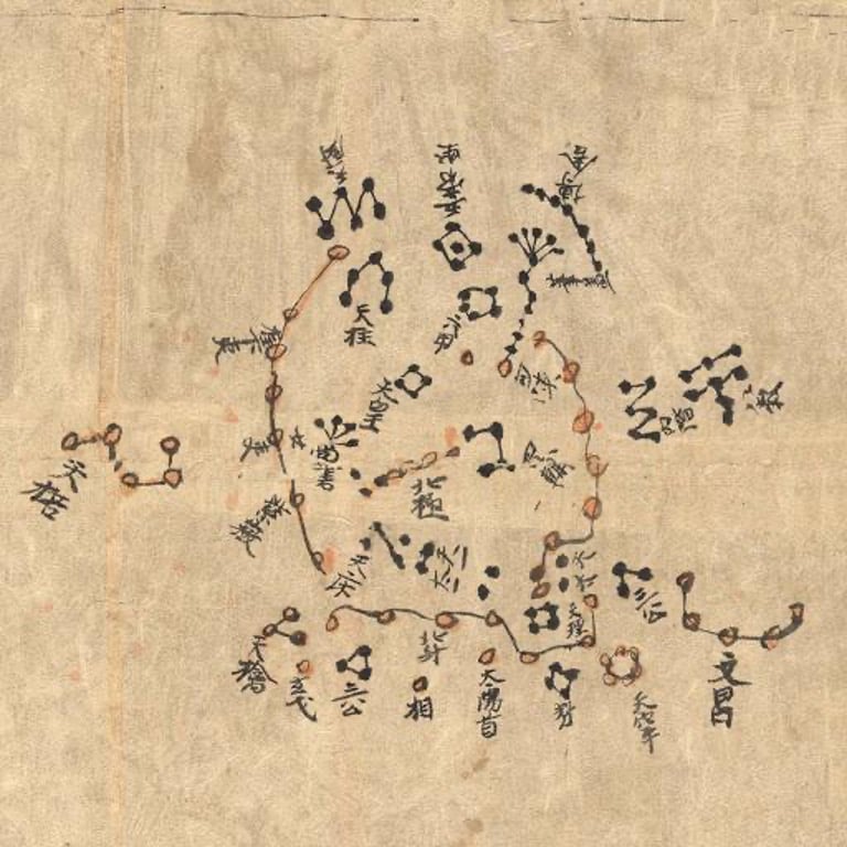 The Dunhuang Star Chart is one of the first known graphical representations of stars from ancient Chinese astronomy, data to the Tang Dynasty.
The star map is, to date, the world’s oldest complete preserved star atlas. It's believed to be from the 7th century showing each of the lunar months.
The Khipu Code - Inka history in knots (1400 - 1532 CE)
Instead of words or pictograms, the Inka used Khipus or knotted string devices to communicate extraordinarily complex mathematics and narrative info.
According to Manuel Medrano and Gary Urton, Khipus are hard to decode because of their variety and complexity.
They contain tens of thousands of knots tied by different people, for various purposes and in various regions of the empire.
 Khipu in the Museo Machu Picchu, Casa Concha, Cusco. Photo courtesy Wikipedia.
The Inka are one of the few civilizations that used physical visualization to communicate.
This level of interactiveness can help us connect closer to our data. In addition to visualizing, there is now the element of touch.
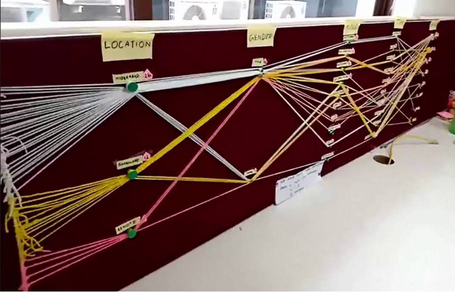
In "Lessons Learned From Creating Physical Data Visualization," Richie Lionell and Pratap Vardhan write about their experiences with creating a physical visualization for one of their monthly hackathons.
They wanted to tell a story about how many employees participated based on teams and office locations.
Richie noted that when doing data visualizations digitally, one can get caught up in the technical capabilities versus the goal at hand. He also noted that he and the team had to really plan on which stories would work as a physical output by hand.
The diagram below shows what they were able to create with limited space.
Data analysts can learn to connect more closely with their data through physical exercises like Richie and his team performed.
He wrote:
“Instead of showing only a summary of the numbers, we wanted to tell a story by visually representing every participant in the physical output, plotting their location, gender, job title, team & tenure.”
He and his team discovered that 45% of the hackathon attendees were with the company for less than 2 years.
They also saw more participation from the leadership team than middle management. This might speak to middle managers having to attend to the more tactical activities and less time for hackathons.
William Playfair (1786)
William Playfair is widely considered the inventor of line, bar, area, and pie charts. He argued that charts communicated better than tables of data.
In his book, Lineal Arithmetic, he wrote:
“As the knowledge of mankind increases and transactions multiply, it becomes more and more desirable to abbreviate and facilitate the modes of conveying information.”
Playfair was ahead of his time since using visualization was not the favored approach to persuasive arguments in his day. The preferred method was well-written arguments supported by data tables.
One of the reasons visualizations might have been frowned upon was due to practitioners such as scientists or economists lacking the expertise to make it presentable for publication.
In 1786, he published "The Commercial and Political Atlas," a compendium of bar and line charts representing different European countries’ imports, exports, wages, and other trends for which he had the data handy.
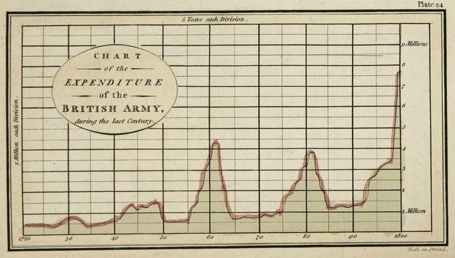
The above chart shows how much the British Army spent year by year.
Charles Minard (1869)
Charles J Minard was a French civil engineer recognized for his significant contribution in the field of information graphics in civil engineering and statistics.
Minard was, among other things, noted for his representation of numerical data on geographic maps. This style of map is called a "thematic map," where a geographic pattern of a particular theme is portrayed in a geographic area. The data attributes portrayed in these maps are usually not naturally visible such as temperature, language, or population.
Minard created 51 thematic maps during his lifetime and is considered a cartographic pioneer in many respects. He is best known for his cartographic depiction of numerical data on a map of Napoleon’s disastrous losses suffered during the Russian campaign of 1812.
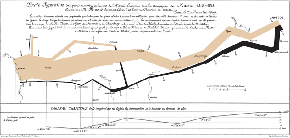 The illustration above depicts Napoleon's army departing the Polish-Russian border while a thick band illustrates the size of his army at specific geographic points during their advance and retreat.
It displays 6 types of data in 2 dimensions:
- the number of Napoleon's troops;
- the distance traveled;
- temperature;
- latitude and longitude;
- direction of travel;
- and location relative to specific dates without making mention of Napoleon.
Looking at the map a little deeper, there are 2 paths or flows depicted:
- The thicker tan band is Napoleon's army marching towards the Polish-Russian border.
- The black band is the army retreating.
We can interpret the narrowing as the loss of lives due to warfare and the cold temperatures.
Mapping US immigration flow using dendrochronology
When I think of thematic flow diagrams, I'm reminded of the beautiful dendrographic created by Pedro Cruz, John Wihbey, and their colleagues from Northeastern University.
The dendrographic represents organic tree growth as the flow of immigrants contracts during times of more restrictive immigration policies. By contrast, economic recession causes the rings to expand during greater opportunities and less restrictive immigration policies.
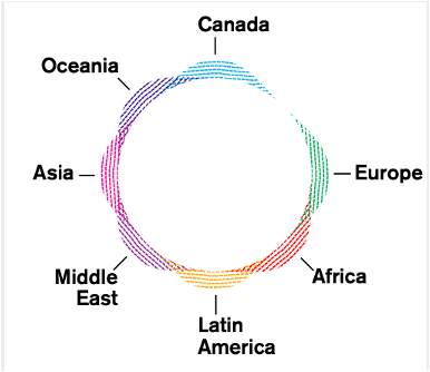
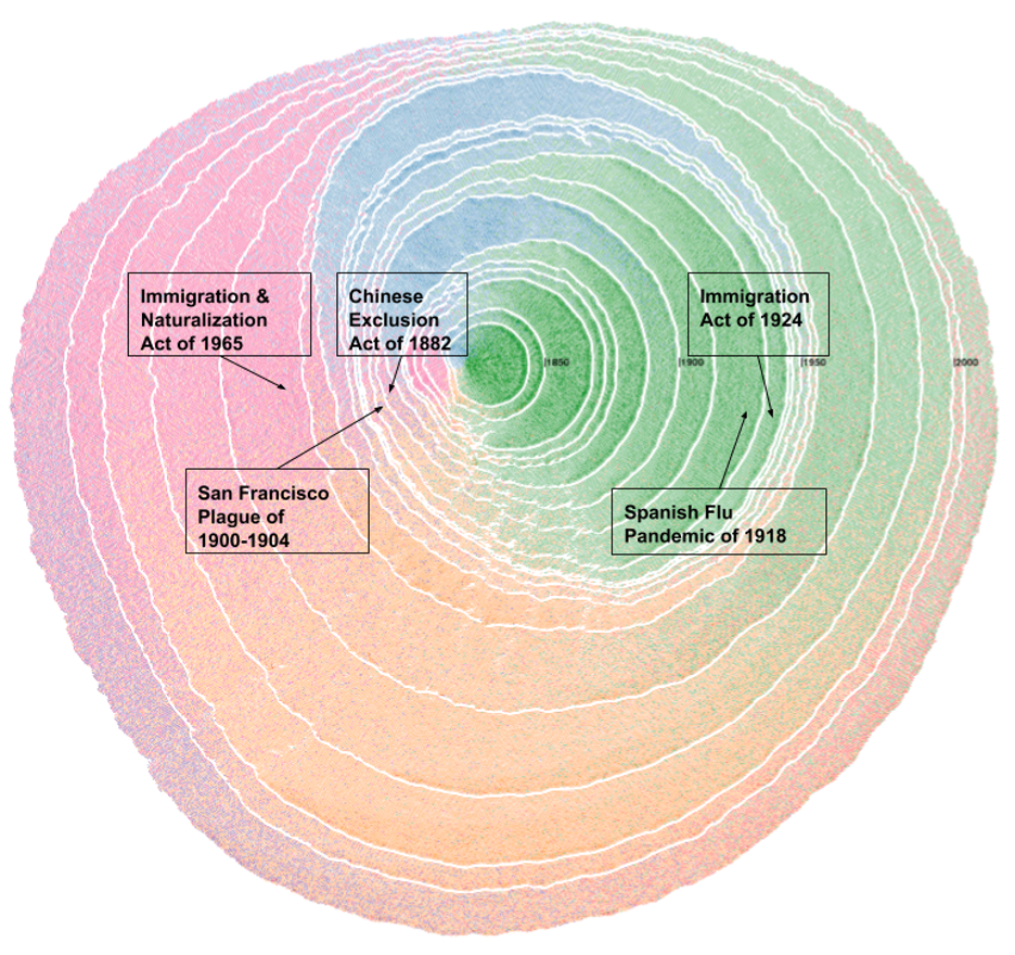
In the diagram above, I overlayed historical events to explore seasonality and provide context to the conditions that contributed to the shifts illustrated.
Florence Nightingale and the Crimean War (1853 - 1856)
Florence Nightingale was an English social reformer, statistician and the founder of modern nursing. She came to prominence while serving as a manager and trainer of nurses during the Crimean War where she organized care for wounded soldiers.
Nightingale arrived in Turkey in October 1854, a year after the war had started, with a group of women to work as voluntary nurses in the hospitals. They were initially denied entry to the wards, and it was not until the hospitals had reached a critical state in March 1855 that Nightingale and her fellow nurses were allowed proper access to the patients.
Nightingale realized that soldiers were dying needlessly from malnutrition, poor sanitation, and lack of activity.
She strove to improve living conditions for the wounded troops, and kept meticulous records of the death toll in the hospitals as evidence of the importance of patient welfare.
Using her data, Nightingale created graphs, which are often described as roses or coxcombs (although she did not refer to them as such), to highlight the death toll from diseases above the death toll from wounds in the Crimean War.
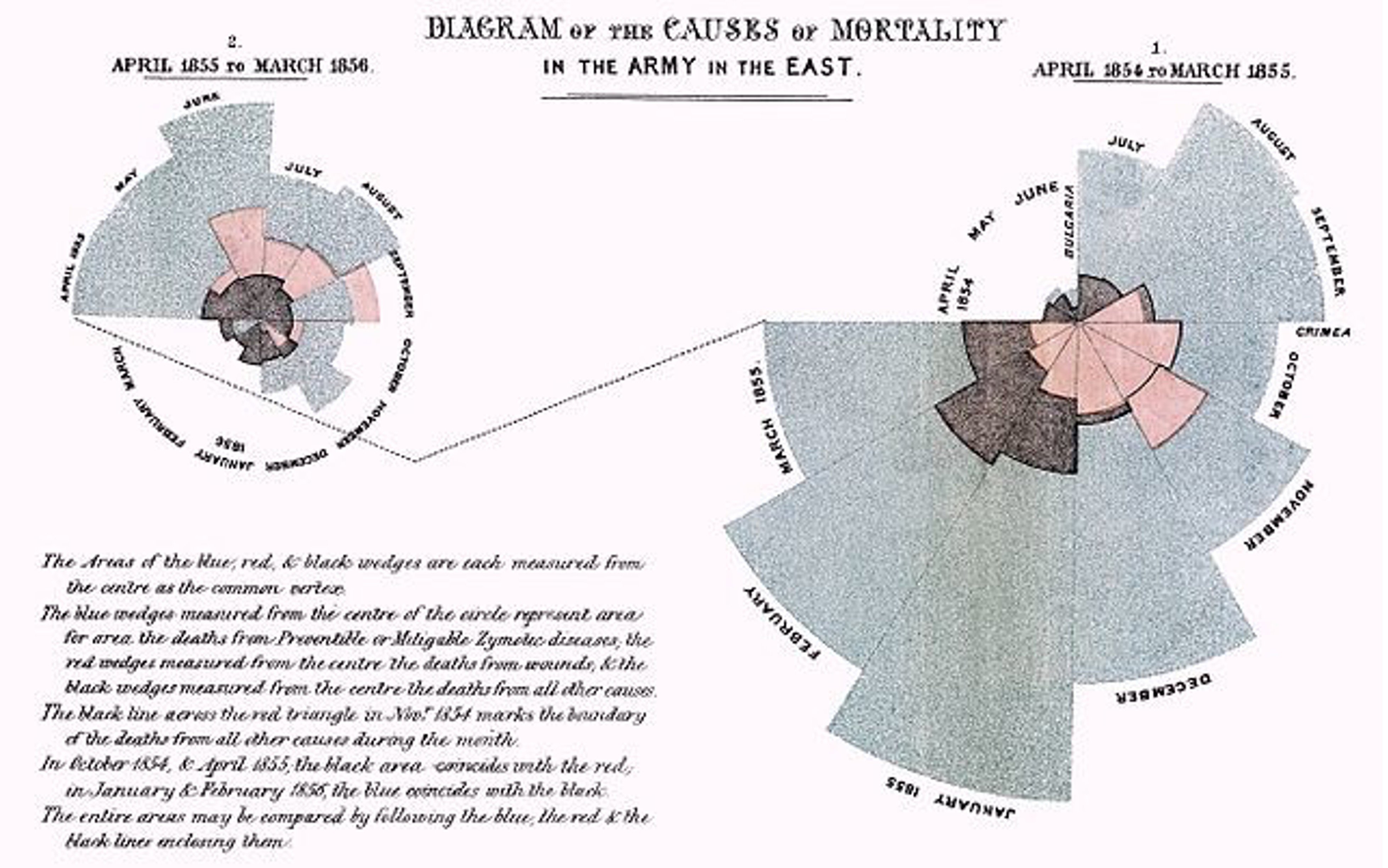
Reading clockwise, beginning with the right-hand circle: the above diagram shows the causes of British soldiers' deaths during the Crimean war.
The British troops arrived in Bulgaria in April 1854, and the war ended in March 1856.
The color shading indicated the cause of death in each area of the diagram.
- The pinkish color represents deaths from wounds received in battle;
- the blueish-grey represents deaths from infectious diseases,
- and black represents deaths from other causes.
What immediately stands out is the overwhelming proportion of deaths resulting from infectious diseases.
Out of the 1.65M soldiers who fought in the war, 900,000 or 55% died. The majority of those deaths were from diseases brought about by the terrible living conditions which they suffered.
On her return to Great Britain, Nightingale embarked on a political campaign to bring about sanitary reform in the army. In an extensive internal report, she gathered an overwhelming body of evidence for her cause, combining rigorous statistics, extensive quotes from reports, internal communications and letters of the medical staff, and a few personal accounts of her own experiences.
This 1000+ page report was called the Coxcombs.
The data visualization above was such a strong diagram that corroborated her claim of the unbelievable losses of soldiers due to infectious diseases that the polar diagram came to bear the name of her whole report.
W.E.B. Du Bois (1897 - 1900)
Du Bois was a famed author and activist who did groundbreaking work in both sociology and data visualization. He was driven by the need to show America, and the world, that there had been progress made by Black Americans post-emancipation.
He created a sociological framework using a combination of census data and interview questions. The result of that study was a collection of 500 photographs and 60 data visualizations that showed the progress Black Americans had made!
This collection was presented at the 1900 World’s Fair in Paris.
Since this was decades before computer software was available, Du Bois created his visualizations by hand. To get his audience’s attention, he created 22” x 28” poster-sized drawings which used bold colors such as red, yellow, and green, as seen in the diagrams below.
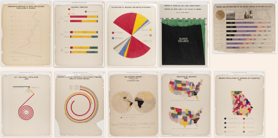
As an analyst, we have to think about our audience constantly. Who is going to be reviewing our findings, and what is their learning curve and experience?
Du Bois knew that he was preparing this presentation for sociology colleagues who held a belief in social Darwinism. They believed that racial disparities existed because people of European descent were superior to those of African descent.
This belief was based on no scientific evidence whatsoever.
Du Bois’s sociological framework was, purposely, built on empirical evidence. Even the preciseness of his spiral charts and angled drawings was a way to show his intellectual expertise.
Another thing Du Bois took into account was the venue.
People would be at a conference visiting numerous exhibits. He had to make sure that he captured the attendees’ attention and keep them engaged with his findings.
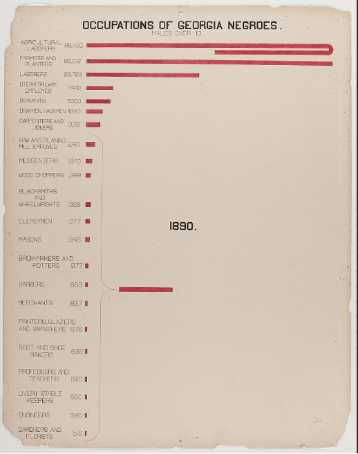
One of the Du Bois visualizations that I admire is the wraparound bar chart. This technique helps to accentuate the disparity between categories in your charts.
Du Bois used the wraparound bar to show how much Black Americans over-indexed on agricultural jobs and to keep the bar in proportion to the others.
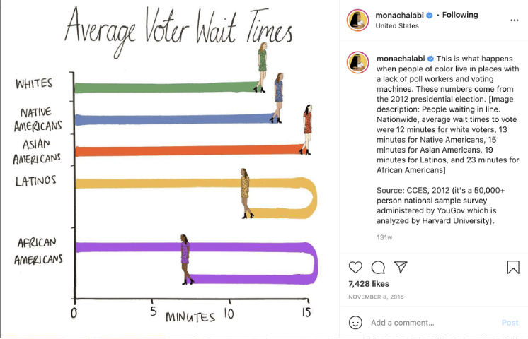
Decades later, Mona Chalabi would use the same concept to show the disparity of voter wait times across racial lines.
As an analyst, I encourage us all to not limit ourselves to the norm. Balance your creativity and audience to tell an impactful story.
Mary Eleanor Spears (1897 - 1986)
Another unsung data visualization pioneer is Mary Eleanor Spears. She was an American data visualization specialist, graphic analyst, and author of two books! She wrote Charting Statistics in 1952 and Practical Charting Techniques in 1969.
One of her major accomplishments that is beginning to reverberate in the datasphere is her development of the box plot. While John Tukey is credited with developing it, it’s come to light that Spears had initially introduced it 17 years prior to his discovery.
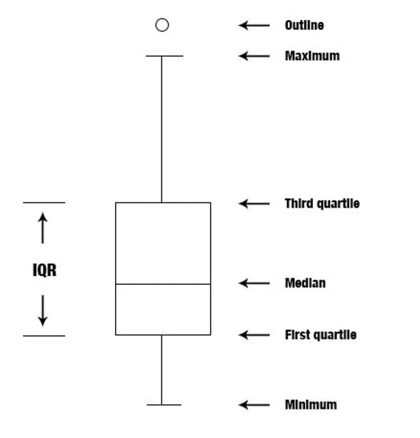
You can check out Spears’ contribution on page 166 of her 1952 book, “Charting Statistics.”
Another key point that Spears has discussed is a team-based approach in presenting charts. She explained the roles needed for successful development and presentation of charts are: a graphic analyst, a draftsman, and a communicator.
I find her point on teamwork important because as data has increased and tools evolved, we’ve become more siloed.
Data analysts today take on many roles. We’re expected to be the data wrangler, analyst, and storyteller, which can be a dizzying feat for most. I encourage you to read more about Mary Eleanor Spears.
Microsoft Excel changed the game (1985)
The most game-changing tool for data visualization was Microsoft Excel, which was introduced less than 40 years ago. Excel empowers people to work with data in unaggregated forms in rows and columns and then produce a visual representation of this data with the click of a button,
The introduction of Excel is a pivotal moment in data visualization because this is where data visualization shifted from practitioners such as cartographers, statisticians, and scientists to business users.
When we revisit our three use cases of data visualization, BI reporting begins to become more commonplace.
Stretching the limits with custom data visualization
Today’s tools make it easy to post dashboards publicly and embed charts within news stories to create a whole new reading experience where complex topics are easier to understand. These days data visualization doesn’t have to be confined to bar and line charts found in corporate reporting.
We can have fun with data!
Analysts, be encouraged by the work we walked through earlier. All of those authors stretched the limits of data visualization in their time. Their work continues to inspire us.
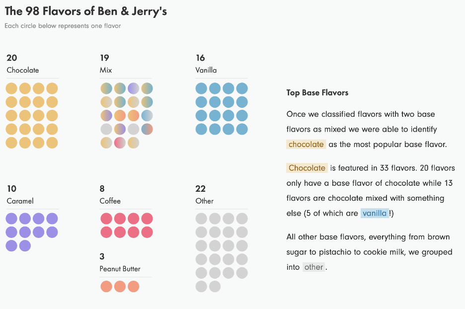
One visualization that I personally find fascinating is The Inside Scoop of Ben & Jerry’s by Hesham Eissa and Lindsey Poulter.
They decided to build a data visualization based on their love for ice cream. They looked at every country listed on Ben & Jerry’s website and recorded the available flavors and descriptions. After standardizing naming conventions, they came up with 98 flavors.
The snapshot below shows Ben and Jerry’s top base flavors.
This visualization can help you create a mental map of the number of flavors that contain your favorite base flavor, which can help you discover your next best flavor!
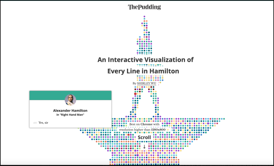
Another must-see visualization is for Broadway fans!
Award-winning creative Shirley Wu has created an interactive visualization of every line in Hamilton, the story of founding father Alexander Hamilton with a musical twist.
When Shirley heard that the musical would be based on rap music, she had her doubts. She ended up enjoying the show so much she became obsessed with the lyrics. As she started digging deeper into the lyrics, she became curious about two things: the relationship between the main characters and the recurring phrases associated with them.
Check out Shirley’s visualization!
Wrapping up the history of data visualization
Data visualization is important in helping us explore trends in data. I encourage analysts to take note of the iconic people mentioned here and those you admire in your own careers.
You should find a balance between knowing your audience and designing visualizations for them while not being limited by a medium or a tool.
As you focus on creativity, allow Panoply to help you with your data needs.
Panoply makes it easy for companies to sync, store, and access all their data from a single source. With data connections that can be set up in minutes, you can start analyzing your data with relative ease.
You can request a personalized demo to learn more!


