One of the most important parts of making data-driven decisions is having easily accessible and up-to-date data available when those decisions need to be made. Rather than searching through your data for answers any time a question comes up, most businesses rely on a dashboard to highlight their most important business metrics and KPIs. Traditionally building a dashboard has meant one of two options:
- A long, engineering-heavy process that required multiple platforms and tools,
OR - A lot of manual updates, pulling data from multiple sources and entering it into a spreadsheet
While the first option can provide some great results, a lot of companies don’t have the time or knowledge to build these out on their own. Not to mention how expensive it could be to engineer their own solution. Meanwhile, manually updating a spreadsheet is not only time consuming, but it can lead to a lot of potential errors.
Luckily, Panoply’s latest release was designed to make building a dashboard as simple as possible. With data collection, storage, and visualization all happening in the same place, users can now go from their raw data from disparate sources to a simple and streamlined dashboard in no time. Follow the steps below to build your own always updated dashboard!
1. Create a Panoply account
This part is as easy as can be. When you sign up for a Panoply account (free for the first 21 days, no credit card required!), you’ll be creating a cloud data warehouse just by filling out our form.
2. Connect to your data sources
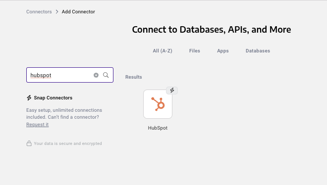
Once you have the data warehouse, it’s time to fill it up by connecting to the data sources you want to report on. This process is super simple with the Panoply Snap Connectors, but if you don’t see your data source listed there, you can work with our support team to build it out using our Flex Connector.
3. Collect your data
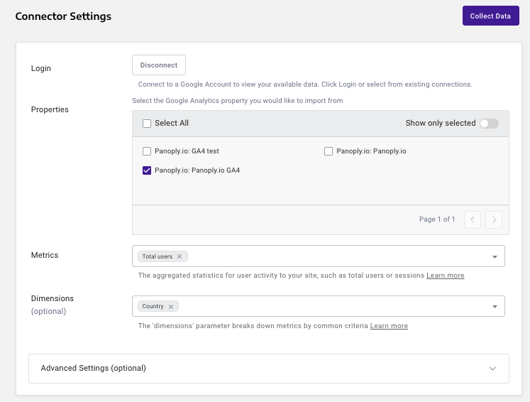
Select which data you want to bring in from your data sources, and connect to each one.
4. Schedule collections
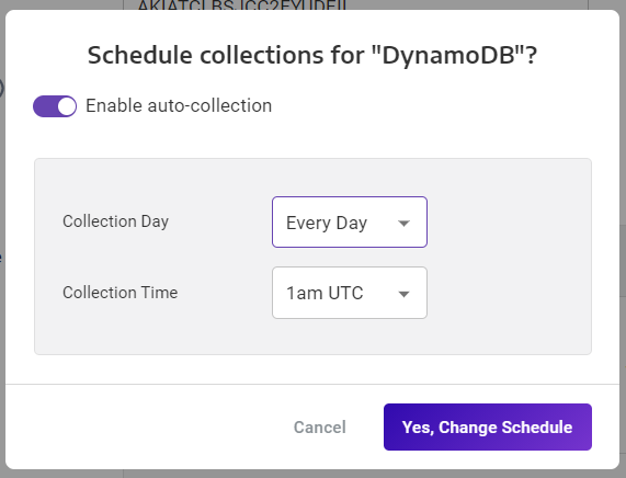
Scheduling collections means that your reports, and therefore your dashboards, will always be updated with the most recent data. No more manually importing new numbers every day! Collections are available as often as once every 10 minutes for premium accounts and above, or every hour for other accounts.
5. Run queries
Ok, this is the most time consuming part of the process, but where you're really building valuable insights. You'll use our workbench to write SQL code to analyze and transform your data using views. By saving a SQL query as a view, you create a query-ready foundation to build your visualizations off of.
(Too technical for you? Keep your eyes peeled for our next big release or contact our sales team or info on how to use Panoply without writing any code)
6. Create visualizations
-1.png?width=676&height=347&name=image-20230309-182618%20(1)-1.png)
See your query results instantly in a chart format - pie, bar, line, or single value. This makes it much easier to derive insights from the data, rather than just looking at a table of results.
7. Save reports
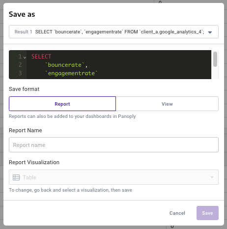
Once you've build a query, you can save it as a report so that you can revisit it later or add it to a dashboard.
8. Create a dashboard
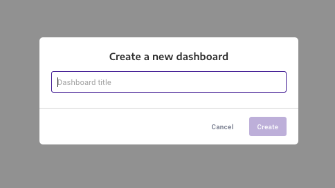
Alright, now we're to the most exciting part! Our newest feature - dashboards. Just click "New Dashboard", and name it whatever you'd like.
9. Add saved reports
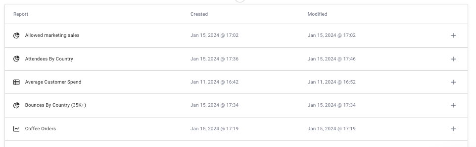
When you're in your shiny new dashboard, click edit, then the '+' to add to it. This will pull up a list of all the reports you've saved. Notice the little chart icons on the right to remind you of what format these reports are in - keep that in mind when adding to the dashboard! Charts and graphs are going to be more visually appealing than tables, but both can be helpful in showing the data you need.
10. Adjust to make a beautiful dashboard!
.png?width=667&height=437&name=image%20(70).png)
Our dashboards are fully customizable, so it's easy to drag and drop all your saved reports around to the order you like. You can also resize each one, and the data within the white square will automatically resize to fit. Feel free to move things around until it meets your needs!
You'll notice in the corner of each chart when it was last refreshed - this will happen automatically, but you can also hit the purple 'refresh' button up in the corner anytime you want your charts to update.
That's all it takes! In just 10 steps, you've gone from raw data in disparate sources across your stack, to a streamlined dashboard that will always be refreshed and ready to review.
Ready to try for yourself?
See dashboards in action for yourself! Schedule a demo call and you'll receive a personalized walk-through of the platform, tailored to your data sources and your specific needs. Plus, our support team is always here to help (not that you'll need it, the platform is super easy to use).


