Regina is a data analyst at Mocha, a fictitious coffee delivery company that provides local coffeehouses specialized technology, data insights, and shared services. She has been meeting weekly with key stakeholders to define metrics that will help expand their customer base in San Francisco. After a month of meetings, she was tasked with building a dashboard that tracks prospective coffeehouse clients.
While Regina is excited to get started on building a dashboard, she is also hesitant. This is the first time that she will be building a dashboard for her organization. Fortunately she’s been meeting with the project’s stakeholders to understand their needs and expectations.
As Regina thinks of the tasks ahead of her, she cracks a smile when she sees the office manager rolling in the whiteboard she ordered earlier this week.
What is a dashboard?
A dashboard is a type of graphical user interface which often provides at-a-glance views of key performance indicators relevant to a particular objective or business process.
But I like to look at dashboards as a medium to tell a story. In fact, cognitive psychologist Jerome Bruner has stated that messages delivered as stories are 22x more memorable than just facts. Everyone can relate to a good story.
When designing a dashboard, we’re usually answering a business question that will give our decision makers insights to improve performance. While good business arguments are developed through the use of numbers, they are typically approved on the basis of a story. Data storytelling is taking a pile of numbers and turning them into a language and a compelling message that everyone can understand.
Start with a vision
Regina’s dashboard will be viewed and leveraged by Mocha’s sales and marketing leads as well as senior management. That means she’ll need to create something that busy execs can understand at a glance to set high-level strategy. At the same time, the dashboard should enable the sales and marketing teams to dig into more granular data so they can execute on a tactical level.
By understanding how different users are likely to interact with her dashboard, Regina can create a vision for what it should include and even some of the features she’ll need to build into it.
Outline the story
Regina made the right decision in buying a whiteboard. While it’s tempting to rush to the data visualization software, it’s important to outline your story first. Today’s tools make it easy to create a variety of charts. What the tools can’t gauge however is your audience and the ability to interpret them.
Thankfully, Regina had the opportunity to meet with her stakeholders over a few weeks to discuss the business questions they were looking to answer. The management team wants to shortlist prospective coffeehouses for their acquisition strategy. They have discussed using several metrics to create this shortlist including population and distance from their current customers.
Regina wears both the marketing and data caps at Mocha. Having familiarity with the data and business context equips her with being able to find the important insights and support them with meaningful metrics.
Perform your analysis
When developing a dashboard to present to users, we’ve usually been given a problem to figure out. Usually these problems are not easy to solve and can lead to more questions before an answer is found. This process can be compared to looking for a needle in a haystack. In searching for the needle, the goal of an analyst is to share what has been found so others can make an informed decision.
The search for needles in the proverbial haystack can be described as exploratory analysis. This is where the searching and analyzing of data to develop insights happens. When it’s time to explain the findings and make recommendations this step can be described as explanatory analysis. This is where we discuss our “sharpest needles” and share these key observations.
When it comes to presenting an analysis to a broad audience, an explanatory analysis is the best way to go more often than not. As analysts we have an urge to provide all the information we came across during our discovery. We assume everyone will have the same enthusiasm that we did diving into the haystack. This is just not the case.
Decision makers in particular are looking for a guided tour through the data. They are looking for a story of what they’re looking at and why it’s important for them to know it. Another great analogy to use when preparing an analysis is “I just want to know the time, not how to make a watch.”
As Regina began to whiteboard her solution she wanted to map out her data sources. She performs a lot of her exploratory analysis in Panoply because she gets to blend data sources together. She compiled third party data on various neighborhood stats such as population and income levels to help the sales team target potential customers. She also uploaded customer data such as sales revenue from the Mocha platform into Panoply. This allows her to blend neighborhood data with customer data to model what potential customers to target.
Know your audience
Understanding our audience is critical with any presentation given. Regina knows how her audience interacts with the data and the stories that can be found in it. She has decided to go with a curated dashboard design.
Regina’s dashboard visualizes the prospective coffeehouses based on the attributes that she has chosen to highlight. Think of these as the sharpest needles from the haystack! This approach allows the data to speak for itself while giving her audience of execs the opportunity to explore different scenarios as they interact with the dashboard. For example, they might want to apply a filter to the income bracket to look at different prospects.
Choose an appropriate chart
As we continue to tell a story with numbers, choosing what charts to display will impact how the audience interprets them. As the analyst, we decide which insights to highlight. Choosing the right chart will make a difference in making sure most important comparisons and trends get called out or obscured. If the charts we create obscure the findings, then ultimately the message is lost and no action is taken.
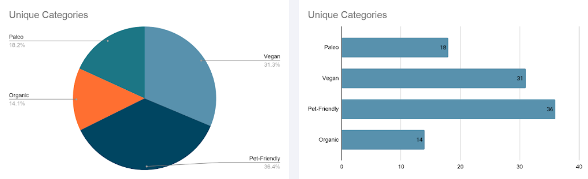
Both charts show the same data, but when it comes to communicating which product is leading the category mix, there's a clear choice.
The Mocha executives wanted to get a breakdown of unique coffee houses that appeal to special customer needs. Looking at the pie chart on the left, it’s hard to spot at first glance that pet friendly is leading the category mix. It’s easier to see it with the bar charts on the right.
Experiment and explore with a variety of chart types to discover which charts best help to communicate the interesting insights in the data. We may find that certain comparisons are easier or more difficult to make depending on the chart type used and the amount of detail included in the chart.
Since the VP of sales wanted to see if a circular chart could still be used for the category mix, Regina decided to try out a donut chart. Looking at the chart below, we can begin to differentiate between the donut slices but it’s still easier to see pet friendly leading the mix with the bar chart.
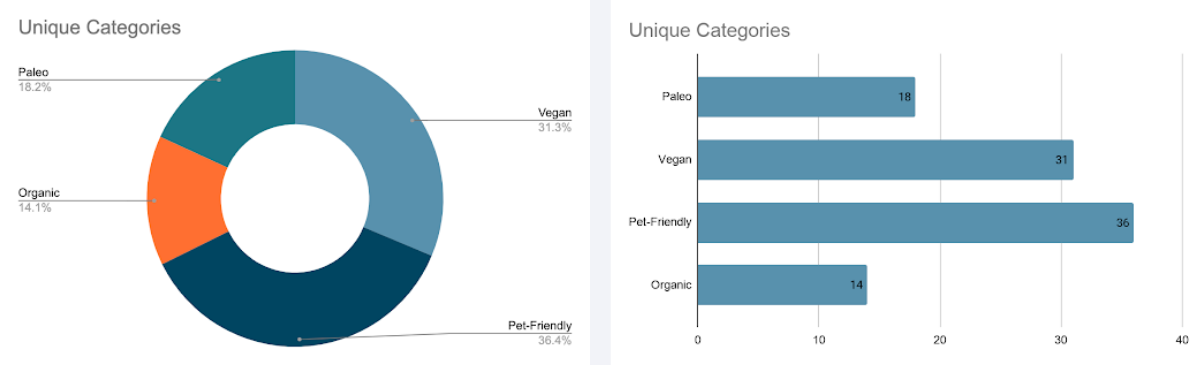
While a donut chart helps, the bar chart still communicates this kind of data more effectively.
When it comes to dashboard design, we recommend that you ultimately choose charts that most people are familiar with and understand how to read. These include bar charts, line charts, and highlight tables.
Add helpful text
Charts and dashboards are more easily interpreted when they include additional text for explanations and context. Helpful text can include titles, subtitles and labels. At a minimum, a chart should have a title that includes details about the measures and categories being displayed. We also encourage the use of subtitles for additional context or instructions.
If you are comfortable with adding more explanatory analyses, develop and include a definitive statement for your chart title. In addition to a helpful title, also consider adding legends or values as labels. Keeping the text near the line in a line chart (or near the bar in a bar chart) helps the viewer to more easily make the connection between the two.
Use color effectively
When it comes to creating a dashboard or any visual presentation, we want to guide the audience’s eyes towards the points we’re trying to make. The colors we use can greatly impact what the viewer focuses on.
For example, Regina wants to add a monthly sales volume view for top performing coffeehouses in a target area. Increased sales volumes could stem from a new business or apartment entering the area and can help with identifying prospective customers to target.
While the chart shows sales volume trends for various coffeehouses over three distinct months, it’s distracting to the eye and makes it difficult to focus on insights...if there are any.
Most of the coffeehouses are showing an increase over time except for J&S Coffeehouse. Should we be concerned about their steady decline? Moving over to the right, we see Java Delight had a sizable month over month increase between February and March. What happens as time goes on and more months are added? Will there be a different color for each month? This will make the chart even more distracting. This distraction can potentially cause user engagement and adoption to plummet.
When using color, be strategic and minimalist as possible. This approach allows us to focus on the details that are most important. Regina decided that she wanted her audience to focus on the current month the report is published. One way to achieve this is using gray or a muted color for the contextual information (i.e. previous months) and a contrasting or bold color to highlight the most important information for the audience to see.
All of these decisions, including the strategic use of color and the removal of unnecessary details helps to focus attention on the most important information.
Another color tip for building dashboards is finding alternatives for using red and green in charts. Red and green are typically used as indicators of unfavorable (red) and favorable (green) trends. One main reason to avoid using these colors is that they negatively impact those with visual impairments like color blindness. Orange and blue is a good alternative to the traditional red and green.
What if we can’t escape colors like red and green because they are a client’s brand color? Dashboard consultant Bridget Cogley suggests minimizing the use of those colors in the dashboard charts and finding other attributes to denote differences and trends.
Putting it all together
When building a dashboard, collaboration is key. A solution that your organization is going to use to help make decisions about the company should not be built in a silo. Make sure to involve stakeholders during the whiteboarding process. This way you begin to know your audience and arm yourself with as much business context as possible.
Data literacy is also extremely important when designing any dashboard. At its core, data literacy is being familiar and comfortable with your data. In addition to having business context, it’s good to know the data points and what’s possible to be analyzed.
One last thought on dashboards is to understand that they are evolving products that should grow with your organization over time. As you begin to dig deeper into your data and solve more business problems, you will build trust with your audience. The questions will change and the dashboards will need to be updated.
Powering your dashboards with a tool like Panoply can make those updates even easier. By making it easy to sync, store, and access data, you can spend less time hunting down datasets and more time performing your analysis and outlining a great story!


