The speed, flexibility and ease of setup of NoSQL-style databases have all contributed to the rapid rise in popularity of MongoDB in recent years.
Despite its advantages in speed and flexibility, though, MongoDB can still be a bit of a pain when it comes to actually analyzing your data, because so many of the analytic approaches and techniques used by data analysts and data scientists currently depend on the more structured, tabular format common to traditional relational databases.
At Panoply, many customers are looking for ways to make analyzing their MongoDB data easier, especially when it needs to be integrated with the rest of their data in a data warehouse. Today, we’re going to explore how you can use Panoply to collect, process and prepare your MongoDB-stored data in Power BI, a leader for Gartner’s Magic Quadrant for Analytics and BI Platforms.
If you want to follow along—we’ll be using a pre-made dataset of city inspection data available from Github that you can load into your own MongoDB instance before starting—or you can just use your own data.
Pulling MongoDB data into your Panoply data warehouse
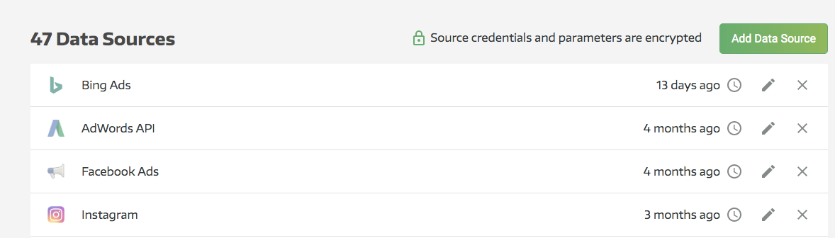
First, you’ll need to connect your MongoDB instance to Panoply (note: if you’ve already done this, feel free to skip ahead to a later section). From your Panoply dashboard, click on Data Sources in the left pane, then hit Add Data Source in the upper right:
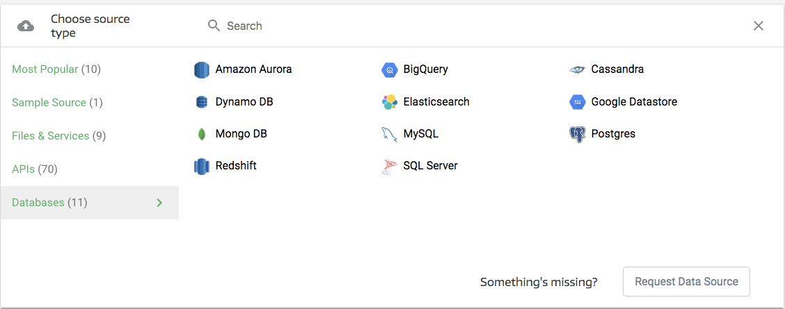
This will take you into the data source selection section. MongoDB will be under Databases (in the leftmost column):
Selecting MongoDB will open a new pane where you can enter your connection details, which will look something like this:
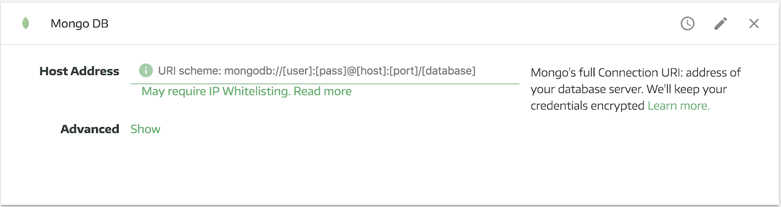
Note that you’ll need a couple different pieces of information to connect Panoply to your MongoDB database:
- Username: the username you use to connect to your MongoDB database remotely
- Password: the password associated with that username
- Host: the address where your MongoDB database is hosted
- Port: the port your MongoDB database uses for connections
- Database name: the name of your MongoDB database
As you can see in the screengrab above, you’ll need to plug all that information into a MongoDB connection URI, which will have the general form of:
`mongodb://[username:password@]host1:[port1],[...hostN:portN]][/[database][?options]]`
Or, more concretely, it should look something like this:
`mongodb://myDBReader:D1fficultP%40ssw0rd@mongodb0.example.com:27017/admin`
Note that Panoply encrypts all login information provided by our users. Once you’ve entered your URI, you can expand the Advanced Options section and set your preferences. In the Advanced Options section, you’ll be able to set the following:
- Destination: allows you to give a name to the table that will be created in Panoply after importing, or a table-specific prefix if you’re planning on importing multiple tables
- Primary Key: allows you to set a primary key that will act as a unique identifier for each record in your table(s), and will also allow you to link related data across tables. If you already have a field in your tables called “id” or something similar, Panoply will use it as a primary key if no other parameter is set. If you don’t set a primary at all, you won’t see any deduplication in your data imports, so every single piece of data from the collection run will be added to your tables--you might not want that. Since your are using MongoDB, the default will be _id.
- Incremental Key: make sure to set this up if you’re planning on making multiple, recurring pulls from this data source. Doing so will make future imports more efficient, as Panoply will only collect data that has been updated since the last time you pulled from that source. Note that incremental keys will only work properly if you are pulling from a single table with this connector.
- Exclude: you can use this field to exclude specific data elements from your import. If there are specific types of data (e.g. irrelevant or sensitive data) that you would like to exclude from your Panoply data warehouse, you can use this setting to manage that. You can exclude nested fields with dot notation. So if my "users" top level object had a field in it called "email", you could exclude that by putting “users.email” in the exclude section in Panoply. Learn more here.
Once you’ve set all that up, click Collect. The Data sources - MongoDB pane will go gray while the process is underway, and a green status bar will appear at the top of the pane. You don’t need to stay and watch it, though. Panoply is designed to allow for multiple, parallel data collection processes, so you can move on to your next data source—and the one after that—while your MongoDB data is being ingested. Panoply will send you an alert when your data collection run is finished, but you can also monitor progress directly or cancel jobs in the Jobs pane.
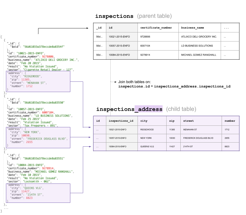
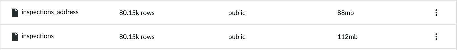
Once all your data collection is finished, you can head to the Tables pane and get a bird’s eye view of all your fresh, processed data. If you used the same sample data we did, your data should have gone from a collection called Inspections looking something like this:
```
{"_id":{"$oid":"56d61033a378eccde8a8354f"},"id":"10021-2015-ENFO","certificate_number":9278806,"business_name":"ATLIXCO DELI GROCERY INC.","date":"Feb 20 2015","result":"No Violation Issued","sector":"Cigarette Retail Dealer - 127","address":{"city":"RIDGEWOOD","zip":11385,"street":"MENAHAN ST","number":1712}}
{"_id":{"$oid":"56d61033a378eccde8a83550"},"id":"10057-2015-ENFO","certificate_number":6007104,"business_name":"LD BUSINESS SOLUTIONS","date":"Feb 25 2015","result":"Violation Issued","sector":"Tax Preparers - 891","address":{"city":"NEW YORK","zip":10030,"street":"FREDERICK DOUGLASS BLVD","number":2655}}
{"_id":{"$oid":"56d61033a378eccde8a83551"},"id":"10084-2015-ENFO","certificate_number":9278914,"business_name":"MICHAEL GOMEZ RANGHALL","date":"Feb 10 2015","result":"No Violation Issued","sector":"Locksmith - 062","address":{"city":"QUEENS VLG","zip":11427,"street":"214TH ST","number":8823}}
```
to something more like this:
In the Tables section of your Panoply dashboard, the resulting tables will be listed like this:
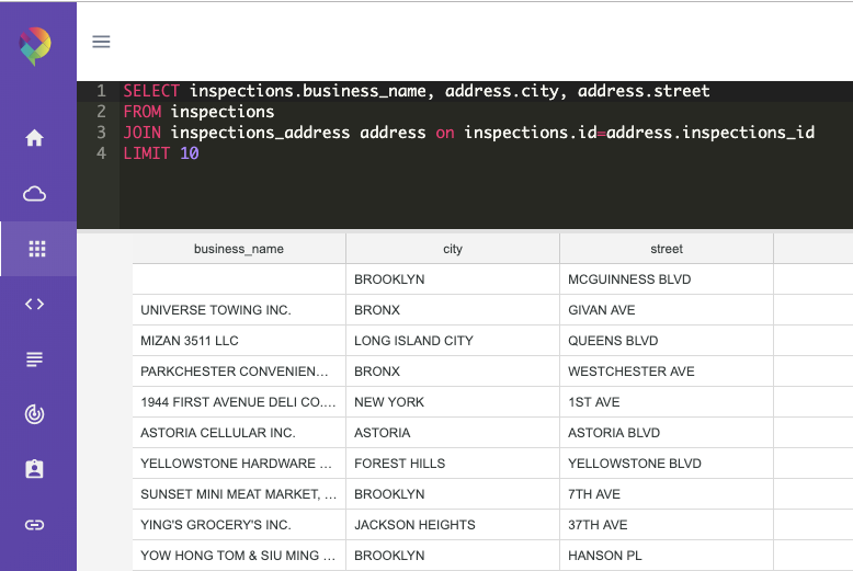
Exploring your Data in Panoply
For a quick check of the data’s structure you can explore the new tables inside Panoply. The query would look like:
SELECT
  inspections.business_name,
  address.city,
  address.street
FROM
  inspections
  JOIN inspections_address address on inspections.id = address.inspections_id
LIMIT 10;
Connecting Power BI to your MongoDB data
Now that you’ve collected the data from your MongoDB and gotten it sorted into tables in Panoply, you can start in on analysis. To do that, you’ll need to connect Power BI to your Panoply warehouse.
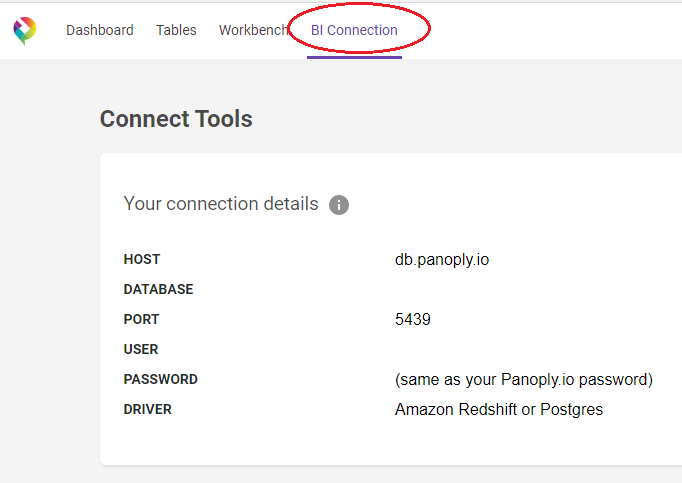
Finding your Panoply connection parameters
First, you’ll need to get the hostname, port and authentication details that Power BI will use to connect to your Panoply warehouse. You can find this by clicking Connect on the navigation pane in Panoply, which will bring up your warehouse’s details, like so:
Setting up the connection in Power BI
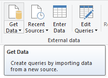
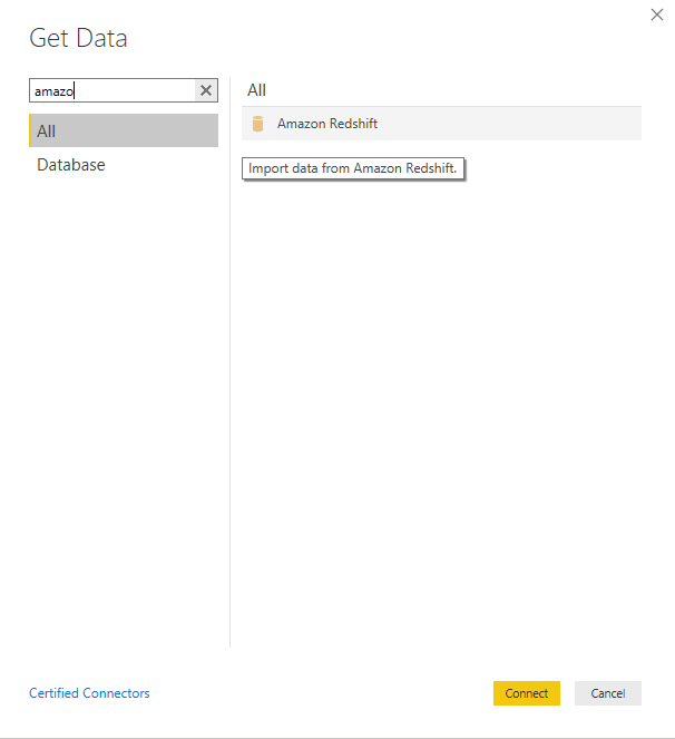
After opening the Power BI Desktop, go to the Home tab and click Get Data.
Find Amazon Redshift connector from the list or quickly find it through the search box. Once found, click the Connect button.
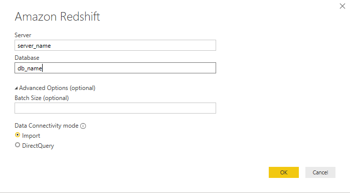
Next, fill out the fields for Server and Database in the following dialog box. You can fill the Batch Size field if you want to batch load the data per specific number of size or rows. Choose Import for Data Connectivity Mode for faster processing of data.
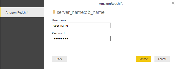
Once you click OK, fill-out the fields for username and password on the next dialog box. Afterwards, click Connect.
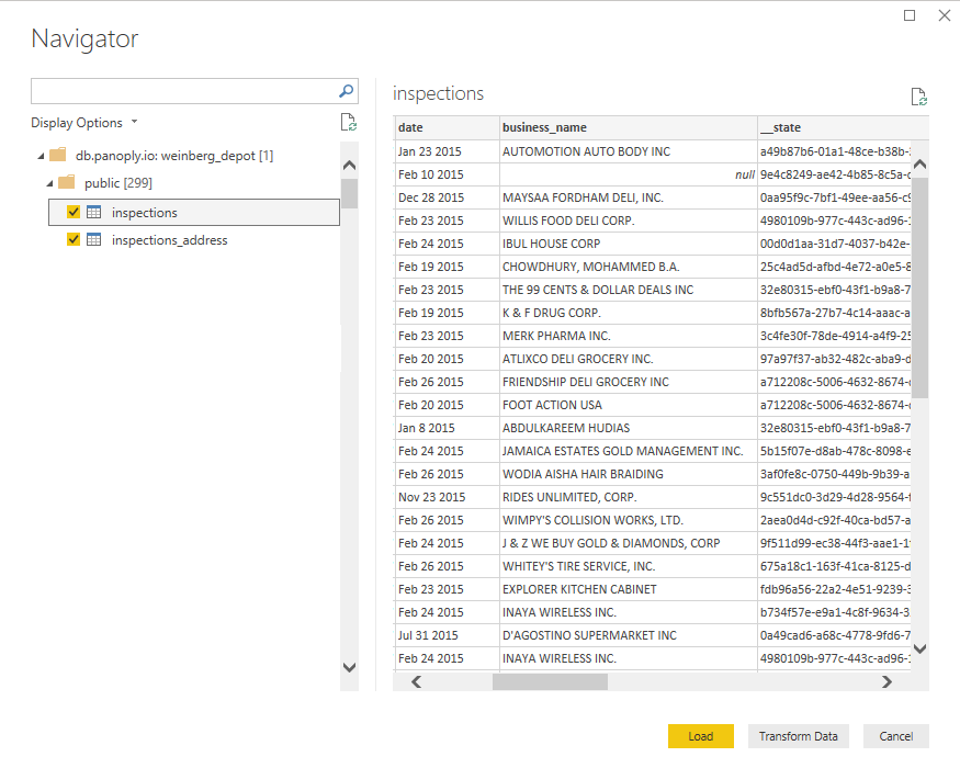
Choose tables that you want to import. Click the table to see a preview of what it contains, or to inspect it to make sure it’s ready for loading or editing. Next, click the Load button if you want to dive directly into visualizing your data--or select Transform if your data needs further cleaning and preparation before analysis (which will be the case most of the time).
Analyzing your MongoDB data in Power BI
For this analysis, we will use the inspections table and inspection_address table from our dataset. First, let’s check out our dataset.
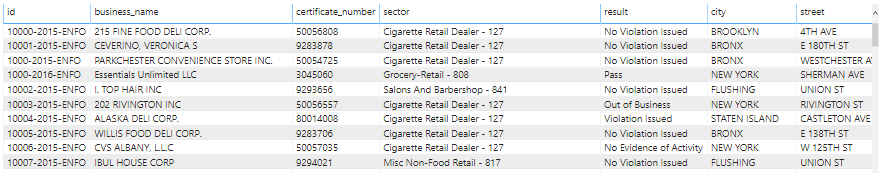
With 80,148 rows and 9 useful fields (id, date, business_name, certificate_number, sector, result, city, street, zip), we can certainly extract something valuable from our data.
Let’s start by transforming the data to make it easier to work with. We’ll do the following transformations:
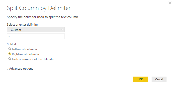
- Duplicate id column on the inspection table and split column by id type to extract it for visual analysis. Right-click on the column, hover into Split Column function and select By Delimiter. The screenshot below provides a visual guide.
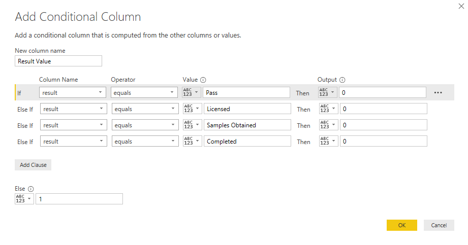
- Add a column with a numerical value that corresponds to positive and negative results based on the results column, like so:
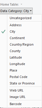
- Properly categorize city and zip columns for plotting on a map visualization. Click a column and go to the Modelling tab, then select its proper category:
- Create measures that count businesses and certificates distinctly:

With all these transformations set up, we can put together a dashboard like the one in the screenshot below. If you want to explore more, you can play around with an interactive version of the dashboard at this link.
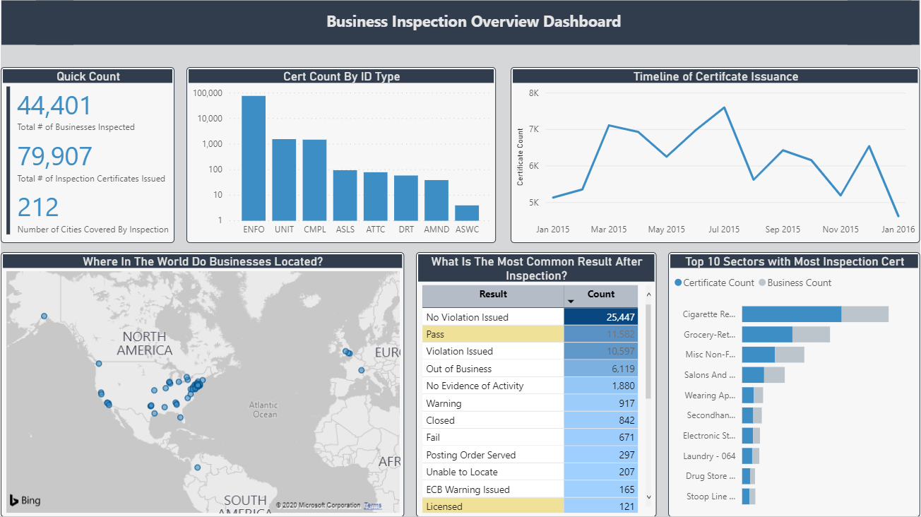
So, what can we see from this data? Certificate issuance rises as it approaches the mid-year and then gradually decreases with the exception of December due to its sudden peak. In fact, it looks like certificates are issued at the end of every quarter, with more issued in the first half of the year. If you’re a business, it seems like you’re best off trying to get a certificate in Q1 or Q2, based on this data.
In terms of inspection results, more than half of the business in our dataset don't have any violations issued. Denoted by light yellow background, only four inspection results are positive and Pass results are less than half of that of inspections resulting in No Violation Issued.
From our dataset, overall, it’s clear that the sector for Cigarette Retail Dealer has the most businesses, as well as the highest number of issued certificate of inspection. But which sector has the highest rate of inspection failure? Find out by exploring the interactive dashboard (hint: from the inspection results table, click the Fail result).
As far as our map display goes, there’s room for improvement here due to the limitations of the dataset itself, as well as Power BI’s geospatial visualization capability. If you want to make a better map view, you can enrich your data by adding more geographical features from external data sources. Try using exact latitude and longitude for more accurate plotting of points.


