Why should people care about visualizing data? Visualizing data can lead to quicker and easier decision making because it allows the user to spot trends, outliers, and other key insights that they wouldn’t have been able to glean from simply looking at a data table or thousands of rows of data.
Why power data viz with a data warehouse
In order to reduce visualization load time and enable efficient data connections, you’ll need to work with a data warehouse that’s capable of integrating with a data visualization engine. Enter Panoply!
Panoply provides a single source of data that's compatible with all major business intelligence as well as data visualization tools; including Tableau, Looker, Stitch, etc.
Data visualization with Tableau
Tableau is a tool that allows users to easily create great looking visualizations without having to learn to code. It enables you to connect to several data sources and transform that data into interactive dashboards with just a click of a button or by dragging and dropping fields into the view.

Connecting to data in Panoply
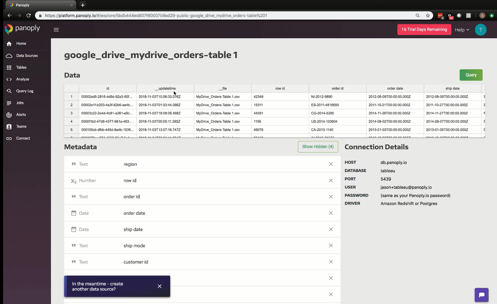
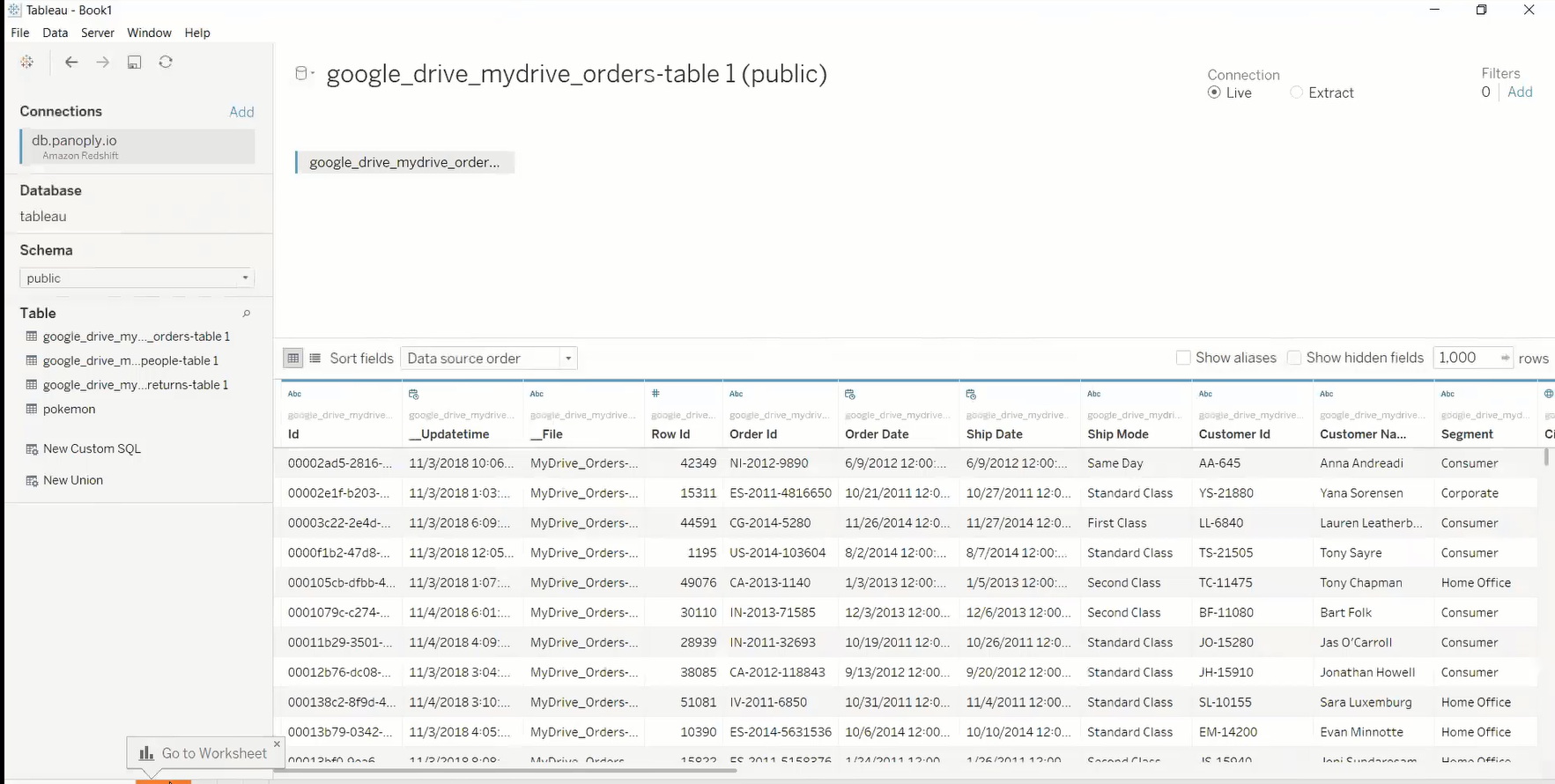
In Panoply, you are able to see the list of data sources within your data warehouse. We can connect to some sample data such as the Super Store dataset shown below (orders table):
You can sign up for a free 14 day trial of Panoply to play around with it and assess the robust features of the tool on your own.
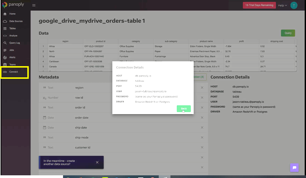
On the Panoply site, you can also access the connection details that are necessary for plugging it into Tableau. These details can be found by clicking on the connect button on the bottom left; which opens up the Connection Details window that has the Host, Database, Port and User name.
Connecting to data in Tableau
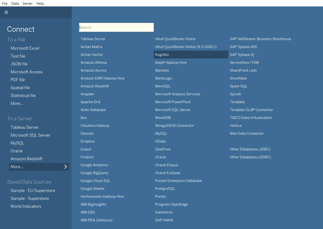
In order to analyze data in Tableau, we first need to connect to a data source, such as Google Analytics, MySQL, Amazon Redshift, etc. Below is an example of the types of data sources Tableau can connect to; we’ll connect to Amazon Redshift, using the connection details listed in the previous section.
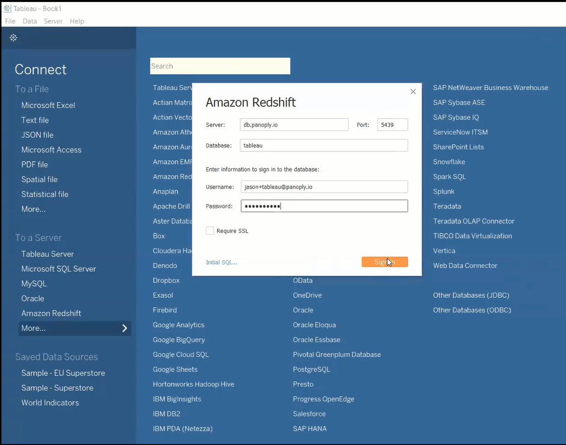
Once we select the Amazon Redshift connector, we are prompted for connection details:
Clicking “Sign In” allows us to connect to the data and provides a glimpse into how the data looks:
Start building charts
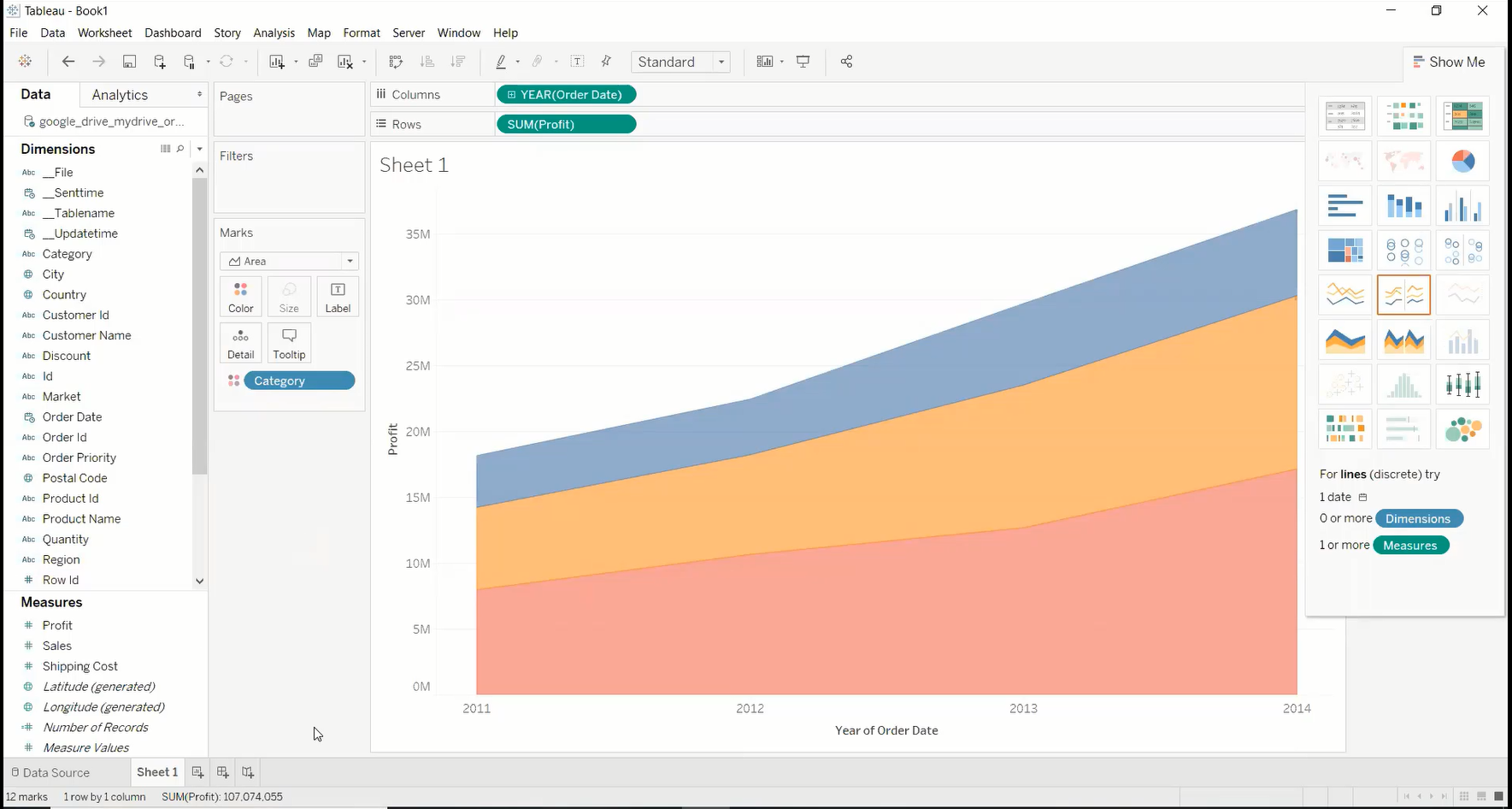
Clicking on “Go to Worksheet” allows us to start building charts, graphs, and dashboards in Tableau. Simply using the drag and drop or double clicking on the dimensions and/or measures in the Data tab, we can create visual representations of our data.
The image below shows the sum of profit by Category over time; represented as an area chart. You can further customize the charts colors, number format, size, etc. or simply use the Show Me option on the right to select a different chart for these data points. You can click on any of the charts that aren’t grayed out to see which one is a better representor of the data.
The grayed-out charts simply show that we need to bring in additional measures / dimensions to enable those charts to be built. For example, since we don’t have any geographic data in our view (e.g. city, country, etc.) we don’t see the option to create a filled or symbol map view.
Building dashboards
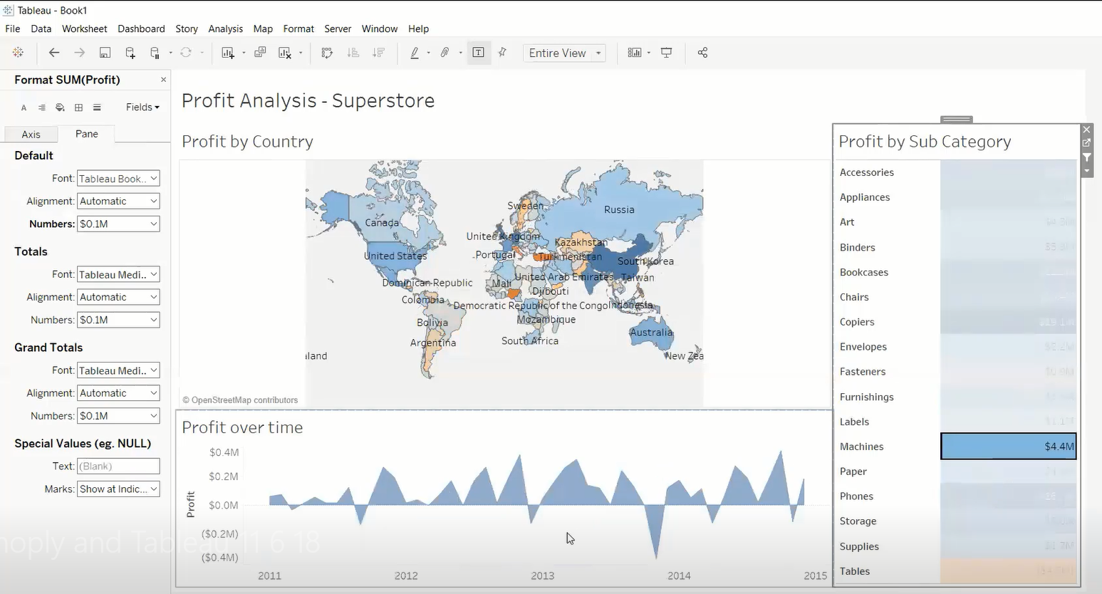
After creating charts in the worksheets, you can create a dashboard (which is a compilation of worksheets, images, and other objects). Tableau has a useful feature called dashboard actions – which enable you to filter, highlight, or pull up a URL with a hover, click, or menu option. The image below shows an example of a dashboard that allows users to click on a product sub-category to update the view of the profit by country and profit over time in the other worksheets.
Dynamic X & Y axis
In some cases, you can build a scatterplot that allows users to have a dynamic x & y axis. With the help of parameters and calculated fields you can add some more interactivity into your dashboards and give more power to users to play with the data without them ever having to learn how to use the software. The below images provides an example of a dynamic scatterplot that is controlled by parameters (over to the right) where the user can select a measure type for each axis.
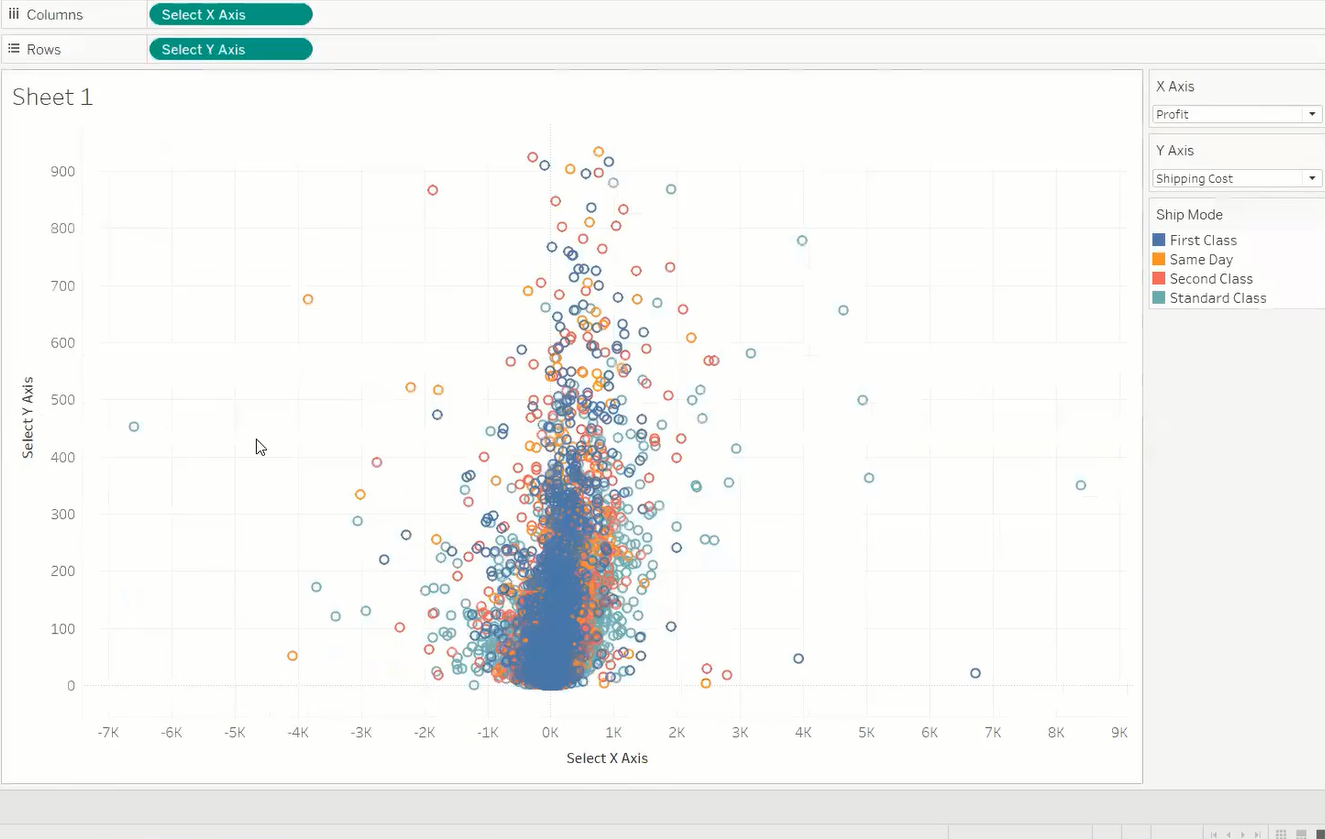
Tableau Public
If you want to play with the software yourself, you can download a free version of Tableau Public.


