Ecommerce is getting more competitive every day as big players like Amazon and Alibaba consume more markets and scrappy D2C players try to disrupt them.
It is impossible to ignore the competitive edge that data has provided for companies large and small, and it is inconceivable to try and compete without it. What does this mean for merchants on the world’s leading ecommerce platform, Shopify? If you’re operating a storefront through Shopify, it’s time to put your data to work. Data is the new ‘soil’ that, when tilled properly, has the potential to bring more profit and even new opportunities for your growing business.
Once you start thinking about data, though, you need to think about how to store, access, and organize your data. All the data generated by ecommerce platforms like Shopify needs to be stored somewhere before it can be consumed for later use either in the form of reports or dashboards.
Storage solutions need to be optimized for fast data processing, trusted security for full control of your data and access permissions, and easy data management that will allow you to easily mix and match data from diverse data sources. This post will equip you with ideas on how you can use a data warehouse like Panoply to squeeze valuable insights out of your Shopify data.
One powerful capability of Panoply is that you can easily connect your data with your favorite business intelligence tools such as Power BI, Tableau, and Google Data Studio. After connecting your Shopify data, you can can move quickly to data visualization and insight generation. Below are some examples of ways you can play with your Shopify data with some of the most commonly used business intelligence tools.
Power BI
Power BI is a powerful business intelligence tool that can turn your Shopify data into a visually appealing dashboard. It will be especially appealing if your organization relies heavily on Excel to build and distribute various reports. It has great integrations with all Microsoft products, but can also be used as a standalone visualization platform. Using Panoply, you can easily connect your Shopify data via Power BI’s Amazon Redshift connector.
Shopify Product Inventory Dashboard
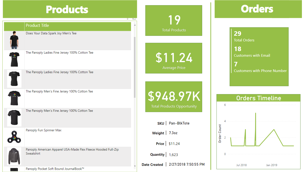
In the above dashboard (created using Power BI), all products are shown in a tabular format with quick figures on total products, the average price of all products, and total products opportunity (the sum of all products’ available quantities multiplied by their respective prices). This dashboard also contains interactive features, as more details like SKU, weight, price, quantity, and date created will also be available once a product on the table is clicked by the user. Check this link to see the dashboard in action. On the right portion of the dashboard, Orders data are laid out in a pretty straight forward rundown of numbers by point of interest and a line chart for orders over time.
Quick Tip:
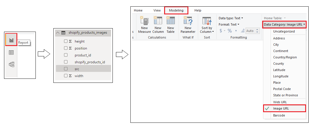
To create a table visual with row images like the above dashboard, your dataset must contain a field/column that has URLs for the path of the images. Once identified, on the Report Page, click the URL column and change its category by going to Modeling tab. Then click Data Category and click Image URL from the options.
Tableau
Tableau has been the leader in interactive data visualization for business intelligence since its inception. Just like its close rival, Power BI, you can connect your Panoply-hosted Shopify data via the Amazon Redshift connector, which exists in both Tableau Public and Tableau Desktop.
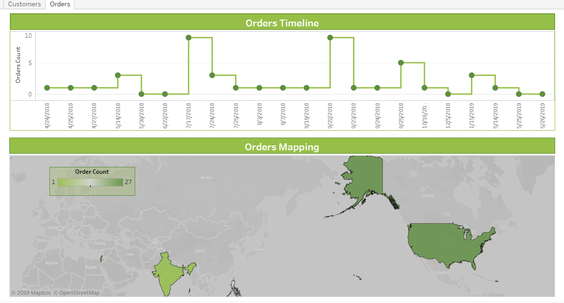
Shopify Geographical Report
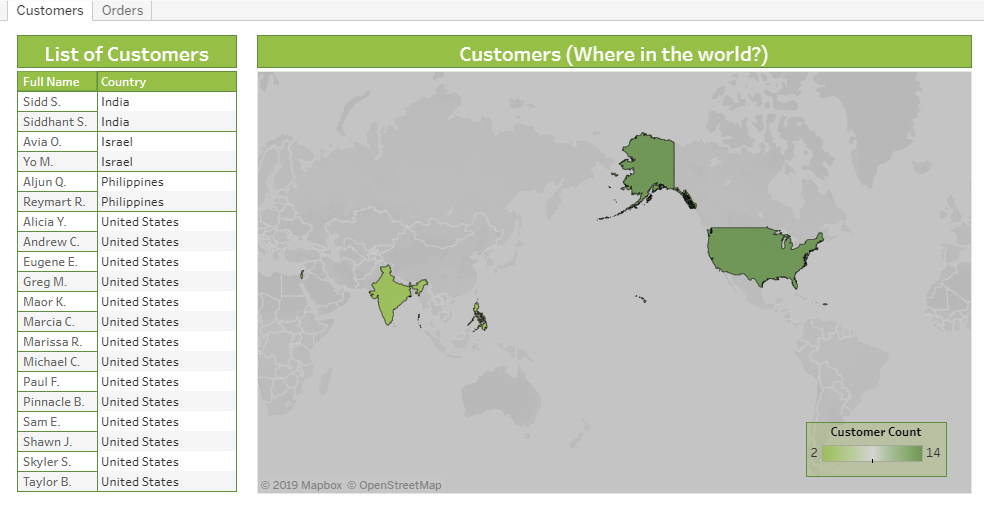
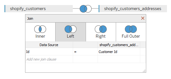
The dashboards created in the sample above focuses on customers and orders data from a sample of Shopify data. The Map visual obviously dominates the two dashboards to showcase the flexibility of map visualization of Tableau. Both maps from the two dashboards may look similar but they differ in measuring the color scale (customer count and order count, respectively). On first dashboard, names of customers are partially masked as a form of data privacy. There are two separate tables for customer and their location that’s why joining both tables is a good idea to achieve the visual. See screenshot below on how it was done.
On the second dashboard, the orders timeline is intentionally visualized in the form of a stepped line chart so that the user can see the timescale of increases or decreases. You can view both dashboards online by following this link.
Quick Tip: In the stepped line chart, the point marks used are customized because there’s no option to resize the size of point marks by default. Just duplicate the measure, make the measures in dual axis mode, and sync the data points.
Google Data Studio
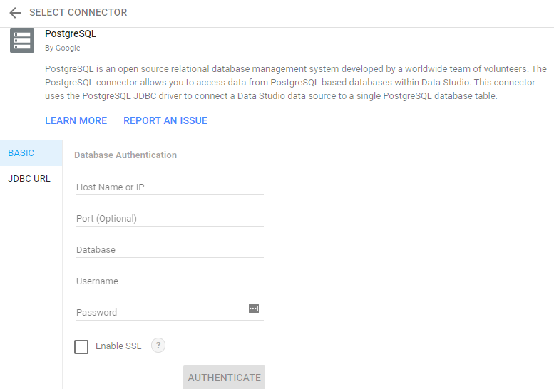
Google Data Studio is another dashboard and reporting tool that is easy to use, customize, and share. With over 120 pre-built data connectors, it can easily connect to your Shopify data. It also has the advantage of being free to use, and works great with Google products. Its sharing and real-time collaboration feature is definitely a win for people who want a seamless workflow across the team. The team can contribute to the completion of a report or dashboard all at the same time with almost no delay and no need for third party software. You can access your Shopify data stored in Panoply data warehouse through its PostgreSQL connector.
Shopify Transactions Report
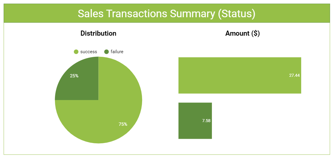
This particular dashboard displays summarized data of Shopify sales transactions, with each transaction categorized as a success or a failure. The dashboard shows the percentage of each transaction status in a pie chart. Next to that, a bar chart lets users see the accumulated amount per transaction status (denoted by the color that in the legend). See this link for the published dashboard.
Quick Tip:
When it comes to sharing reports or dashboards, Google Data Studio provides a flexible feature wherein creators/analysts can control how the user will interact with the shared report or dashboard. You can share publicly, within your organization only, or to specific people you want to be notified.
Aside from the above examples, you might also want to check out our post on how to build a Shopify ecommerce dashboard with Looker.
Integrating Shopify Data
Now that we’ve covered how to build fast, good-looking dashboards with your Shopify data, let’s talk about how Panoply can help you as you build out your Shopify data pipeline.
Panoply is a cloud data platform that lets you sync and store Shopify, Google Analytics, Facebook Ads, and other data sources with just a few clicks. Once the data's synced, you can query it with SQL directly in Panoply's workbench or connect a BI or analytical tool to discover critical insights about your ecommerce business.
You can blend your business’s Facebook Ads data with your sales data to understand your buyers' demographics and to track how many targeted customers made a purchase in your storefront. And by combining your website’s Google Analytics data and Shopify data, you can better understand your customers and their behaviors (visitor count, most viewed products, least popular service, etc.).
But most importantly, by using Panoply, you can spend less time worrying about technical aspects of data infrastructure and focus on what matters most: generating more profit.


